Account data needed a dependable home
Company and member information had to be easier to inspect and update without switching tools.
Dialogue · B2B product discovery
A research-led concept that reorganized company profiles, billing, subscriptions, and support tasks into a focused experience for account teams.
At a glance
From research to concept
Interviews surfaced the needs, the ecosystem map showed where the portal fell short, and the information architecture proposed a new structure. Select any artifact to jump to it.
Project snapshot
Dialogue’s portal served both internal account managers and customer-side administrators. I explored how to separate internal operational work and build a focused portal around what each group needed.
The challenge
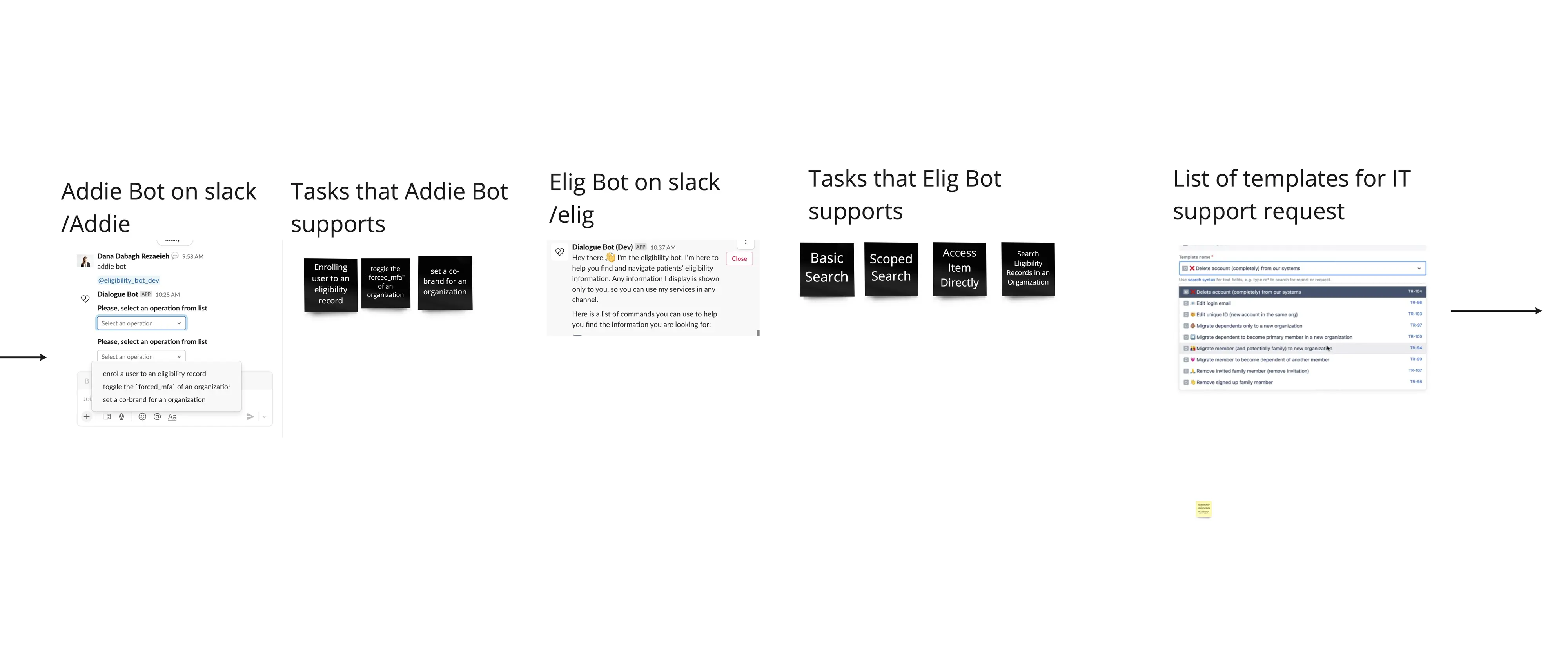
Account managers used the portal alongside Slack bots, support-request templates, and help from technical teams. The scattered toolset made routine tasks hard to find and hard to complete consistently.
How might we create a dedicated account-management experience that reflects real workflows while separating internal operations from customer self-service?
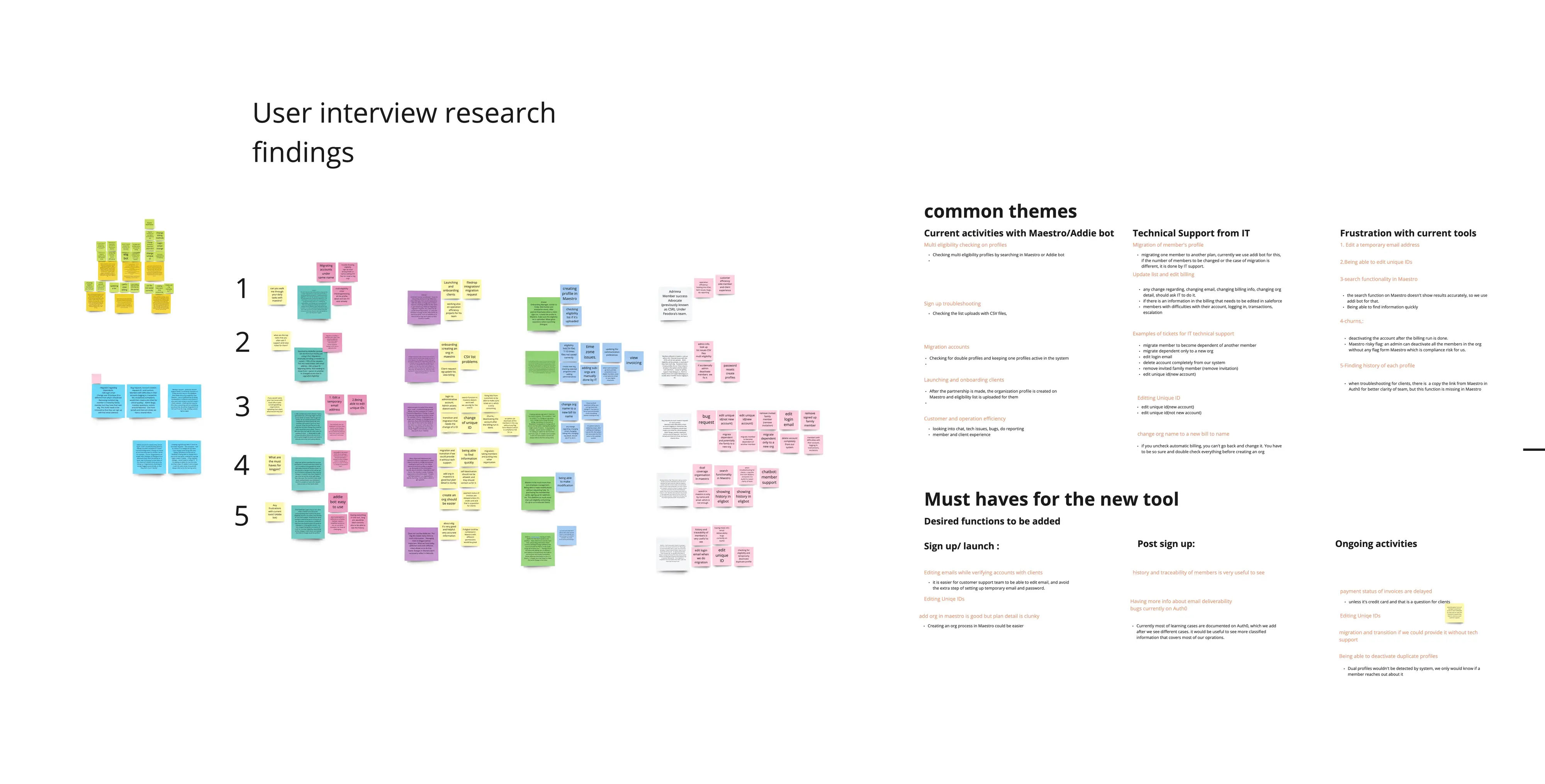
Research synthesis
I grouped interview findings into common themes and turned them into must-have capabilities for a future tool.
Company and member information had to be easier to inspect and update without switching tools.
Slack bots and IT requests were not edge cases; they represented tasks the portal did not adequately support.
A clearer boundary was needed between operational administration and customer self-service.
Current-state ecosystem
Before proposing screens, I documented the external tools and support channels account managers used to finish their jobs.
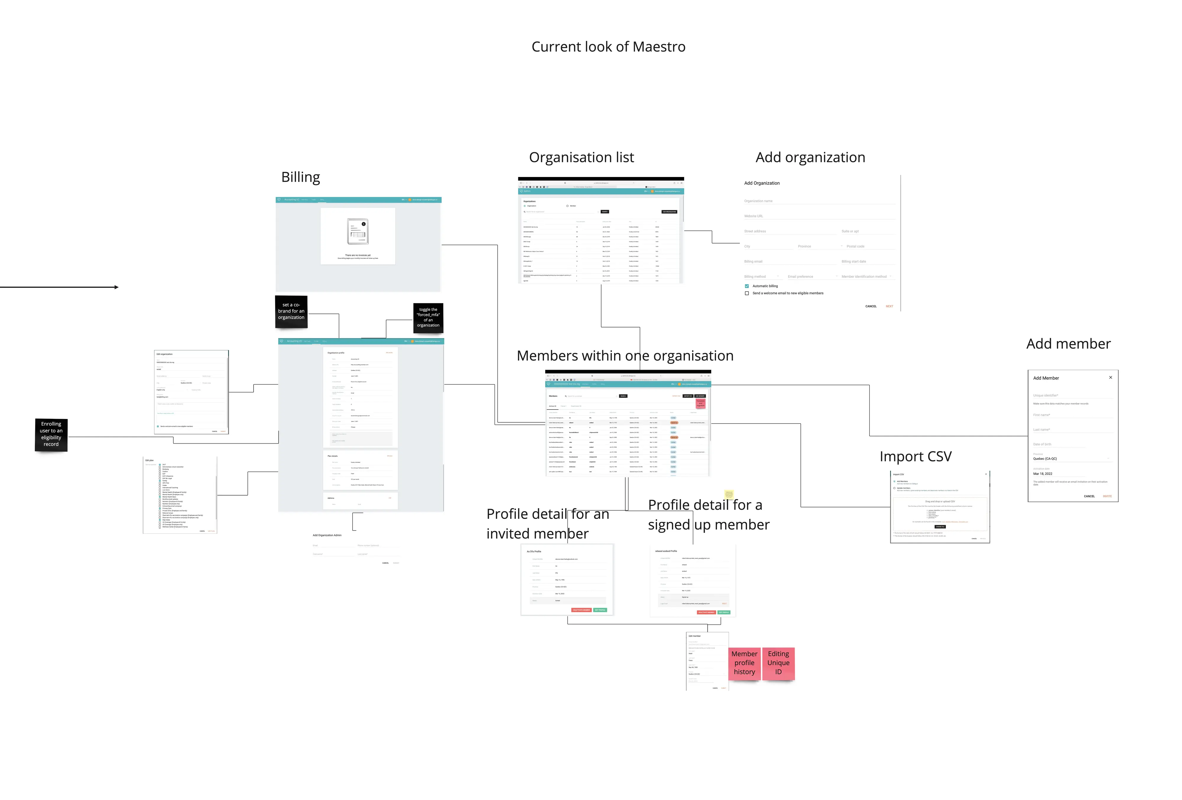
Existing product
I mapped the current interface and its connections across billing, organizations, member records, imports, and profile details.
Information architecture
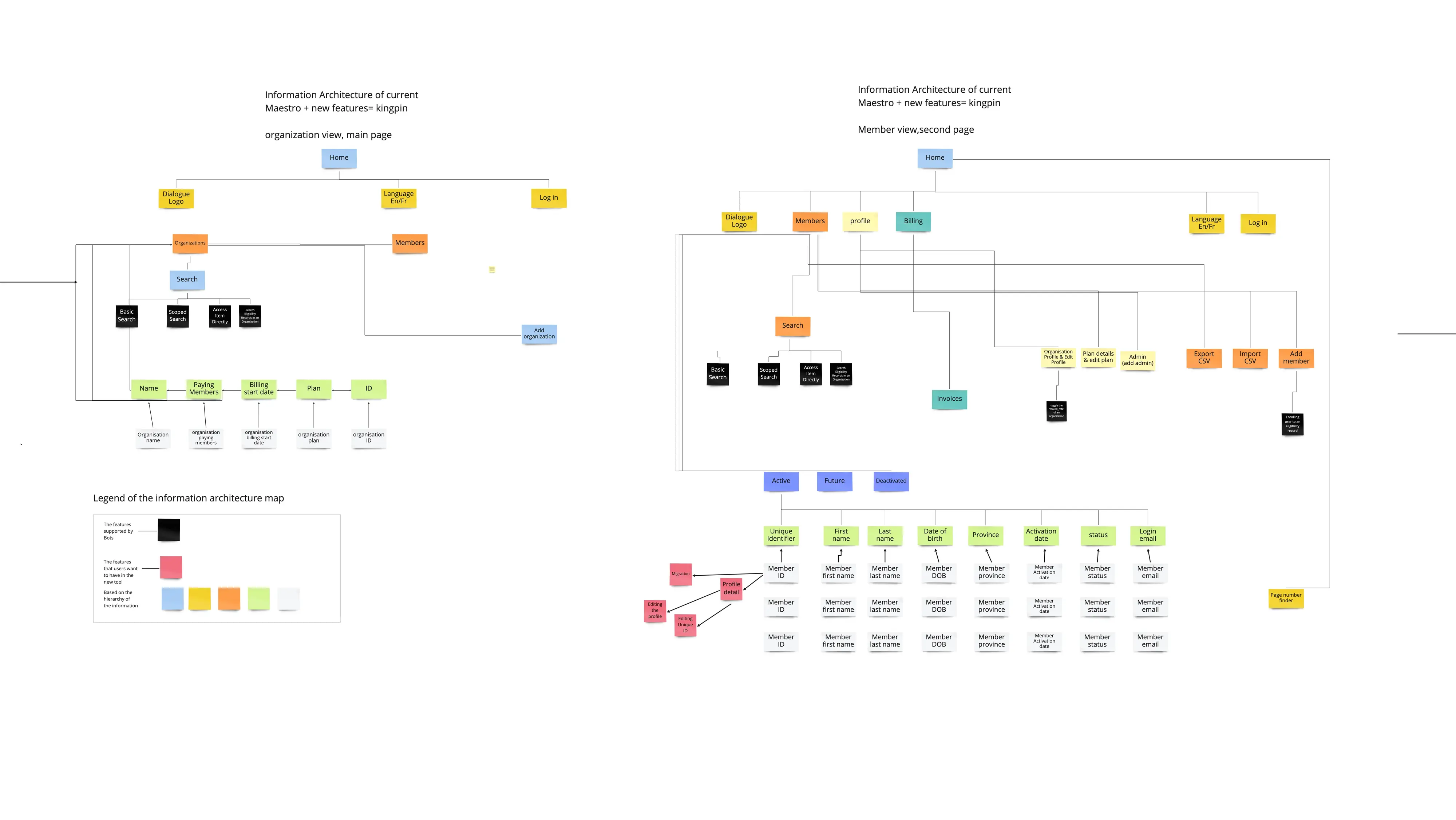
The proposed hierarchy separated customer-facing administration from internal operational tools while preserving the relationships among organizations, members, subscriptions, and billing.
Design progression
Low-fidelity wireframes tested the structure of organization lists, profiles, billing information, and editing workflows before visual refinement.
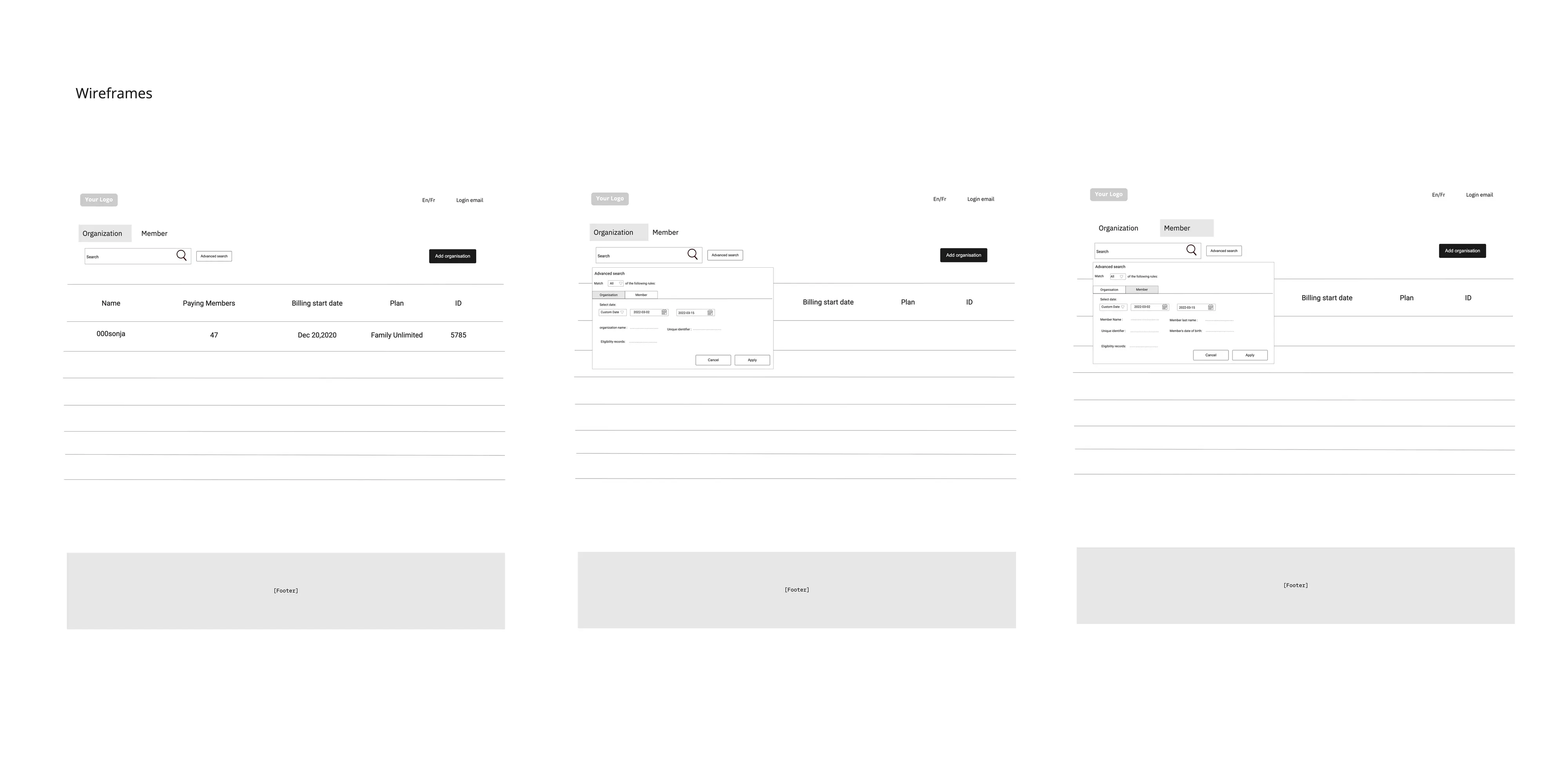
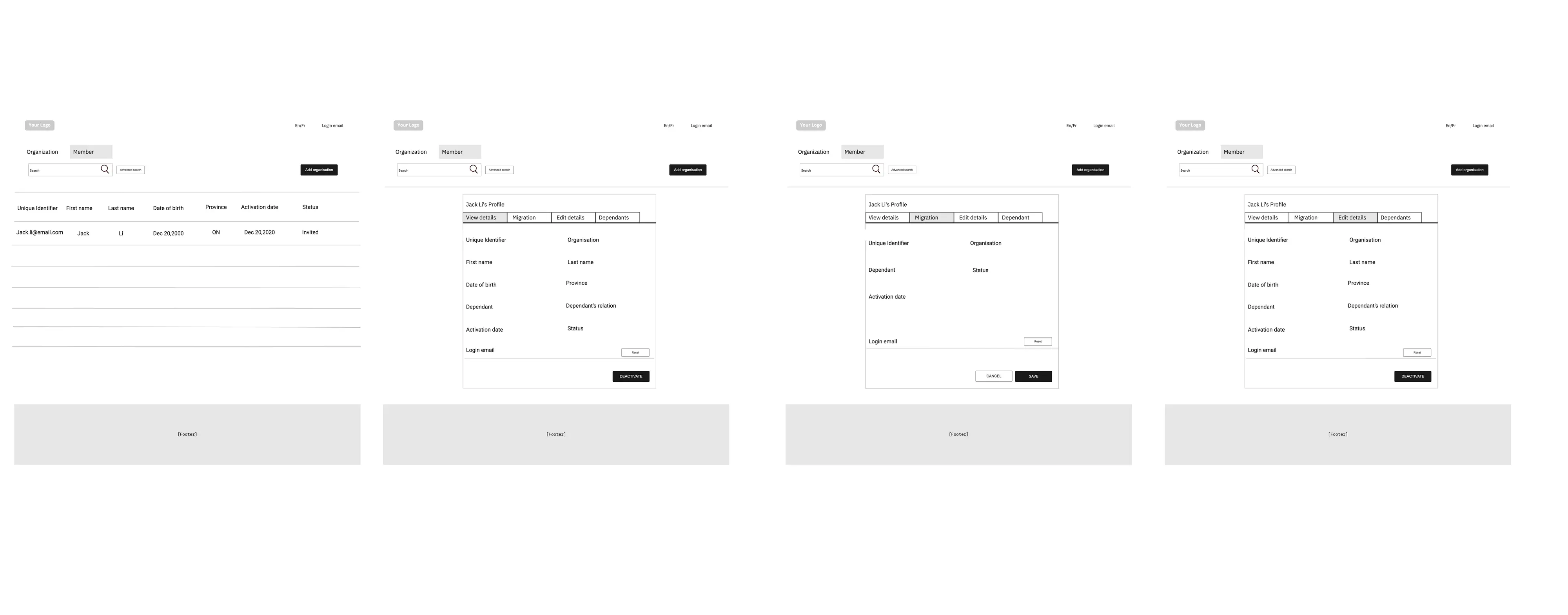
Prototype evolution
The first prototype made the information architecture tangible. After product-planning conversations with the Product Manager, a later concept expanded the feature direction.
Translating the proposed hierarchy into an interactive product direction.
Extending the experience after product-manager review and feature brainstorming.
Proposed product model
View and maintain company-level information in one dependable location.
Inspect, add, and update member records within the appropriate organization.
Bring financial and plan information into the same account context.
Reduce reliance on scattered tools by supporting recurring operational needs directly.
Outcome
The project produced a synthesis of account-manager needs, maps of the current ecosystem and portal, a proposed information architecture, low-fidelity workflows, and two prototype stages.
This was a discovery project, so there are no launch metrics. If it moved forward, the next step would be to test the proposed information architecture with account managers and measure task completion on recurring work such as updating a company profile or changing billing details.
Reflection
Mapping only the portal would have missed much of the real job. Slack bots, IT requests, and manual support showed where the product no longer matched users’ responsibilities.
The most valuable move wasn’t a screen. It was widening the research frame before deciding what belonged in the new portal.
Selected work
Two Canada Life projects went from research to release in the group-benefits portal.