Tree-test participants
For estimate submission, 10 chose Make a claim and 9 chose Benefits. For tracking, 16 chose Benefits and 6 chose Overview—evidence that one hidden path would not match everyone’s mental model.
Canada Life · Released product
A research-led redesign that made a buried, time-sensitive service easy to find, submit, and track.
At a glance
What shipped
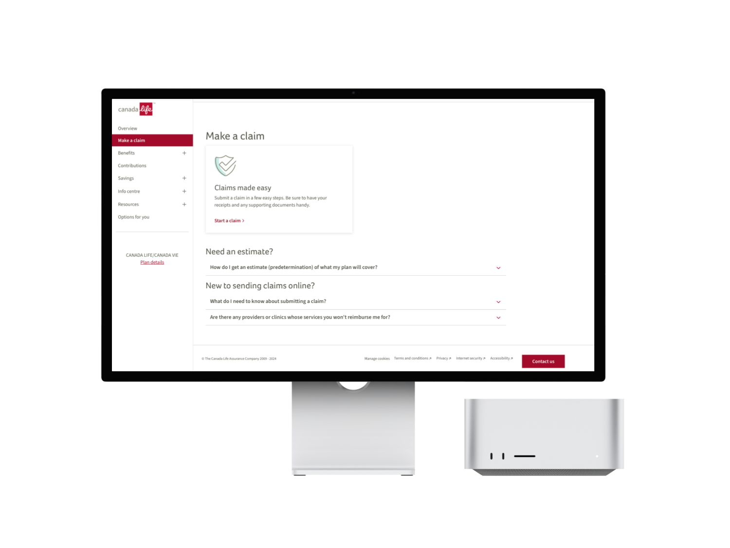
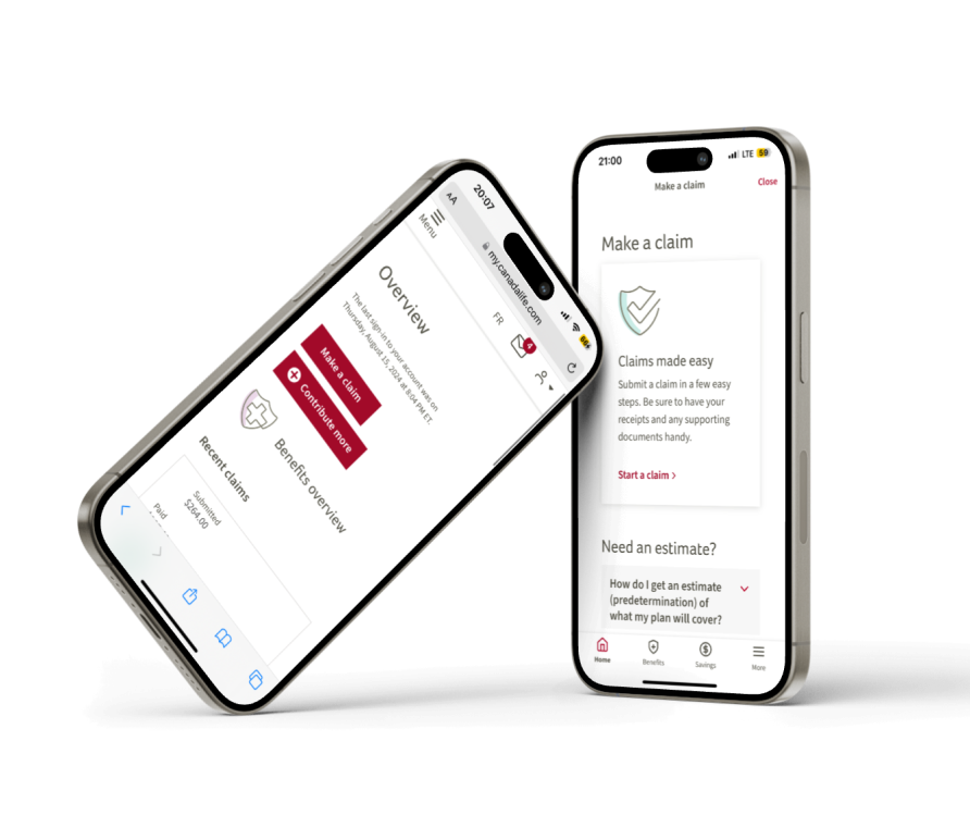
Understanding requirements, starting an estimate, and finding submitted estimates stay prominent on every screen size. I reviewed these decisions with engineering throughout delivery.
Project snapshot
An estimate, also called a predetermination, lets members check expected coverage before treatment. I led the UX for a standalone path to submit and track estimates in the group-benefits portal, designed within Salesforce Industries and Lightning Web Component constraints.
The problem
Before an important procedure, members needed to know what their plan might cover. But the estimate option sat inside other claim categories, the terminology was inconsistent, and there was no obvious place to track a submitted request.
How might we make estimates and predeterminations easy to find, submit, and track—without requiring members to understand the organization’s internal terminology?
Evidence
I combined behavioural data, information-architecture research, and unstructured customer feedback.
For estimate submission, 10 chose Make a claim and 9 chose Benefits. For tracking, 16 chose Benefits and 6 chose Overview—evidence that one hidden path would not match everyone’s mental model.
Adobe Analytics recorded 20,032 English and 4,145 French estimate submissions over a 13-month period, demonstrating meaningful demand for the service.
Recurring themes included difficulty finding estimates, unclear terminology, and uncertainty about where to track a submitted request.
Information architecture
The flow redesign separated estimates from unrelated claim categories and added access from locations supported by the tree-test findings.


Interactive comparison
Compare how the entry point, terminology, and route changed.
A concealed route that depended on familiarity or assistance.
A visible destination with a direct path to the task.
Design exploration
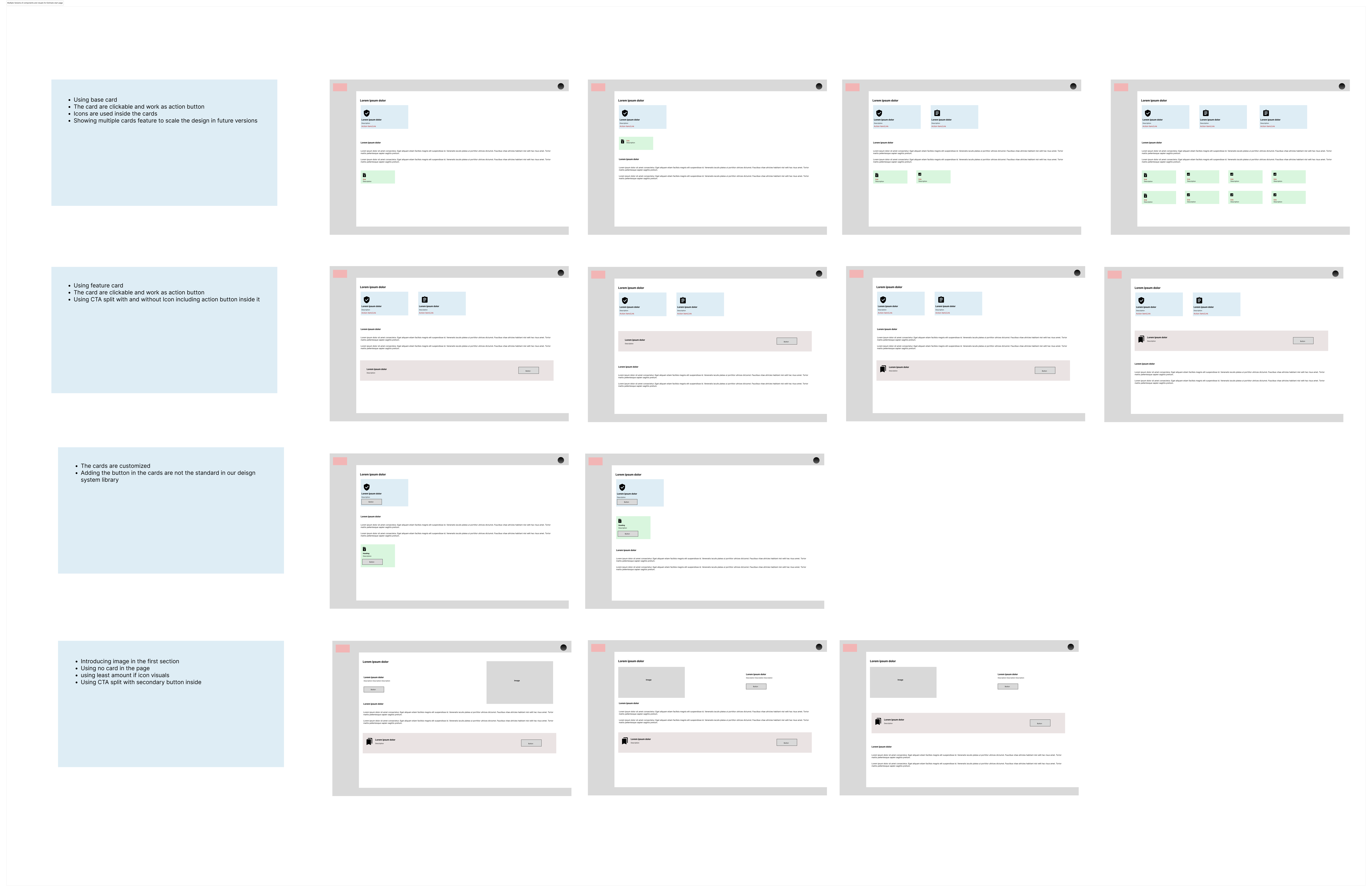
I explored combinations of content, controls, and component patterns, then aligned with the team on the direction that best balanced clarity with Salesforce component constraints.
Design decisions
Customer language and insurance terminology appear together, reducing the burden of knowing the official term.
Members can enter from Make a claim and the left navigation, reflecting the different locations revealed through tree testing.
Required documents, starting the request, and tracking prior submissions are gathered into one recognizable destination.
The redesigned structure reduced the documented flow from seven steps to four while preserving necessary insurance information.
Experience in motion
These recordings show the final flow across both responsive contexts.
Outcome
steps in the primary journey, with required insurance information preserved
responsive experience live in the Canada Life group-benefits portal
Post-launch call-volume and satisfaction data aren’t included here. To measure impact, I would track monthly estimate submissions and support contacts asking where to find estimates.
Reflection
A well-designed form cannot help members who never find it, so navigation, language, and tracking have to be designed as part of the service.
Combining several evidence sources also kept me from treating one entry point as obvious. Members hold different mental models of the same task, so the final structure offers more than one way in.
Next project
A guided, step-by-step claim journey built during the move to Salesforce.